bqplot: An Interactive Plotting Library for the Jupyter Notebook
 Image credit: bqplot
bqplot
Most of my open source work focuses on bqplot, an interactive visualization library for the Jupyter notebook. bqplot is based on the ipywidgets infrastructure, which I also used to work a great deal with.
One of the things (looking back at it) that I like best about bqplot is the object model API. It seems like a much more natural way to generate plots than some of the other Grammar of Graphics adaptations that I’ve seen. Partly I think because we were constantly shifting between application/widget development and library development - we represented users much better than other projects I’ve worked on.
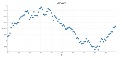
For e.g. to generate a simple interactive scatter plot, first we import the requisite libraries:
import numpy as np

size = 100
np.random.seed(0)
x_data = np.arange(size)
y_data = np.cumsum(np.random.randn(size) * 100.0)
Then we import and declare the Scales, which are mappings from data to pixels.
from bqplot import LinearScale

# Let's create a scale for the x attribute, and a scale for the y attribute
x_sc = LinearScale()
y_sc = LinearScale()
Now we need to create the actual visualization (what we call the Mark). The Scatter object takes in the x_data, the y_data and maps them to the passed scales like below:
from bqplot import Scatter

# Let's create a scale for the x attribute, and a scale for the y attribute
scatter_chart = Scatter(x=x_data, y=y_data, scales={"x": x_sc, "y": y_sc})
We also need to draw Axis (which is the 1D visual representation of the Scale). Notice that all that separates the x-axis from the y-axis is the orientation parameter.
from bqplot import Axis

# Let's create a scale for the x attribute, and a scale for the y attribute
x_ax = Axis(label="X", scale=x_sc)
y_ax = Axis(label="Y", scale=y_sc, orientation="vertical")
Finally, we put it all together into a Figure, which we then display:
from bqplot import Figure
from IPython.display import display

fig = Figure(marks=[scatter_chart], title="A Figure", axes=[x_ax, y_ax])
display(fig)
The coolest part about bqplot is that this Figure is a live-object (an ipywidget), and so is every component of it! So, we can change it!
scatter_chart.y = 2 * y_dataYou should see something like this!
We can make the plot interactive by allowing it to be moved.
scatter_chart.enable_move = TrueGo ahead, drag one of the points!
Now, here’s where the magic of widgets comes in. Let’s create a function foo which will be called whenever the y-data of the scatter chart is changed.
def foo(change):
    print("This function is called whenever the y-data is changed!")
Finally, we tell scatter_chart to call foo whenever y is changed. We do this by using observe to register the callback.
scatter_chart.observe(foo, 'y')If you move any of the scatter_chart points, foo should be called! That’s it! That’s all it takes to make an interactive plot in bqplot.
bqplot Talks
Here’s a video of us speaking about it at Scipy 2017!
I gave a more extended talk at PyData Seattle
And at and PyData Ann Arbor
For some of our Deep Learning visualizations, have a look at my talks at PyGotham
And at PyData NYC
Licensing Information
This software was released under the Apache 2.0 license.
Dhruv Madeka
Member of Technical Staff, Anthropic
I’m a Research Engineer working on LLMs, and GenAI.